
Biings Design System
Build consistent user experiences with a comprehensive set of assets and guidelines. Accelerate design and development, ensuring brand cohesion across products.
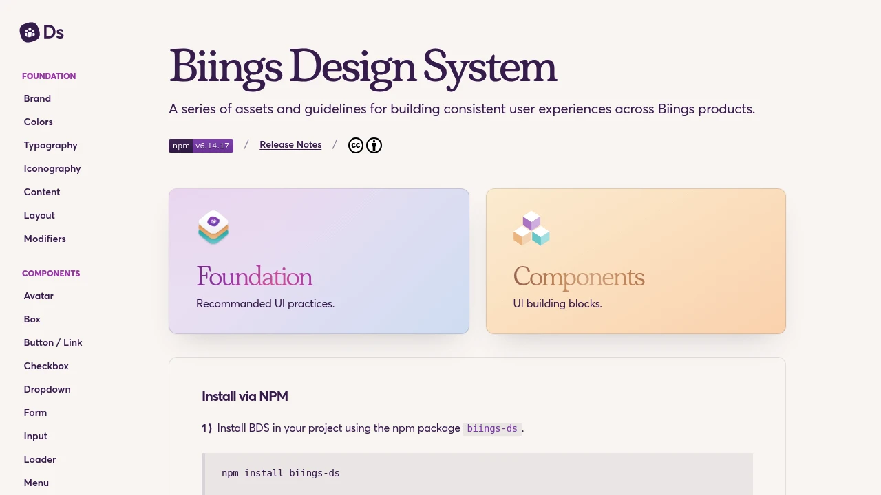
Biings Design System provides a comprehensive collection of reusable components, clear guidelines, and design principles to help teams create cohesive and high-quality user experiences across all Biings products. This system acts as a single source of truth, fostering better collaboration between designers and developers.
Key benefits include:
- Accelerated Workflow: Speeds up the design and development process by providing ready-to-use UI elements and patterns.
- Enhanced Consistency: Ensures a uniform look, feel, and behavior across different platforms and applications, reinforcing brand identity.
- Improved Collaboration: Establishes a shared language and understanding, reducing misinterpretations and rework.
- Scalable Solutions: Facilitates the growth and evolution of products by offering a flexible and adaptable framework.
- Higher Quality Products: Promotes best practices in UI/UX design, leading to more intuitive and user-friendly interfaces.
By leveraging these assets and guidelines, teams can focus on solving user problems and innovating, rather than reinventing common UI solutions.
Categories:

 Untitled UI
Similar to Biings Design System:

Reimagine commerce with this starter kit.
CompanyFigma+1 more
Develop and enhance Shopify admin interfaces using this comprehensive starter kit. Build, contribute, and evolve merchant experiences for reimagined commerce.

Build cohesive experiences, faster.
Adobe XDCompany+2 more
Develop cohesive applications faster with a rich library of design components, patterns, and tools. Achieve consistency and improve team productivity.

Unified design for coherent digital experiences.
Company
Develop consistent user experiences across products and communications. Offers dark mode, custom themes, and high contrast for better accessibility.