
Cal DS
Access comprehensive design system and branding guidelines. Find design tokens, ready-to-use assets, and direct Figma links for Cal.com's design system.
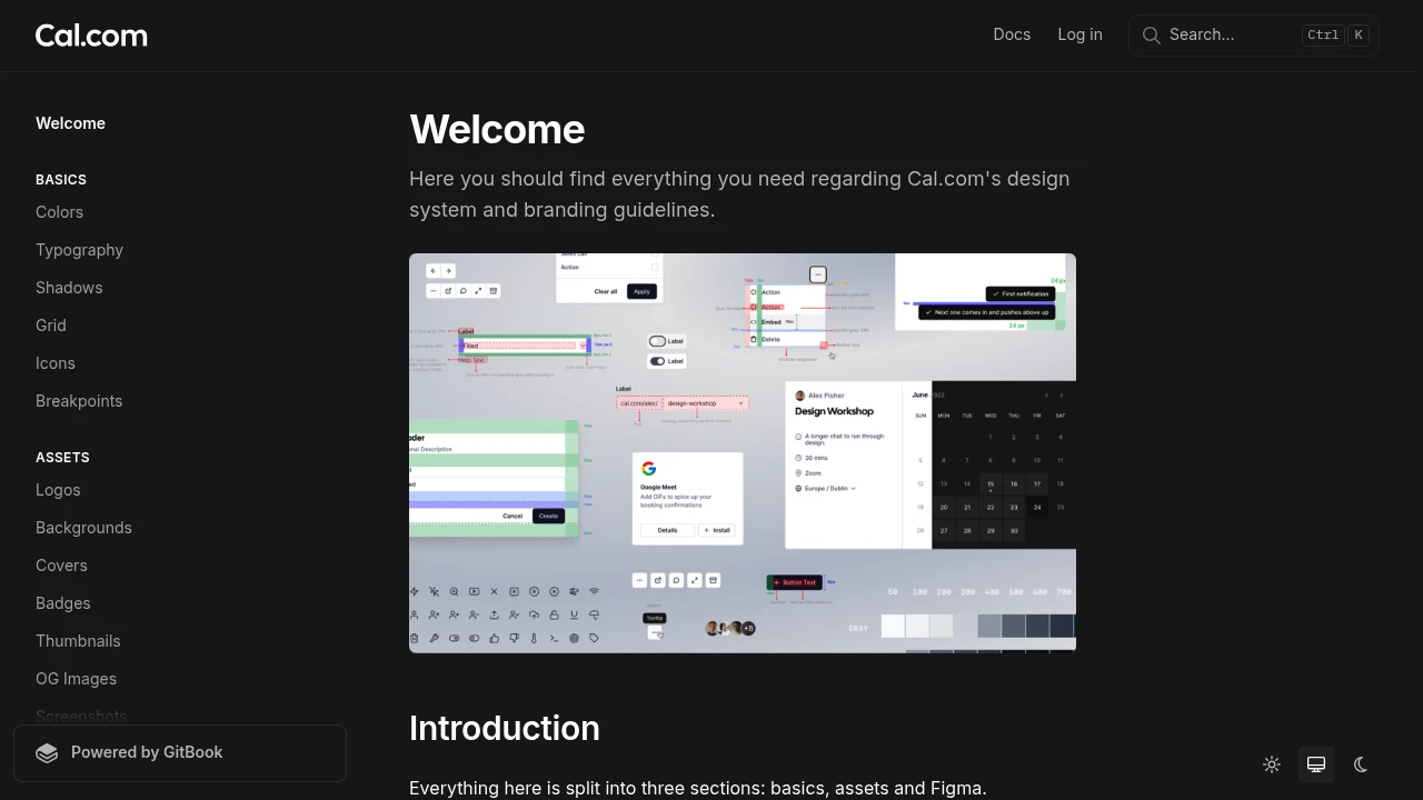
This resource provides everything you need for understanding and implementing Cal.com's design system and branding guidelines. It is structured into three key sections to facilitate easy navigation and use:
- Basics: Delve into the fundamental design tokens and foundational elements that form the core of all design work. This section ensures consistency from the ground up.
- Assets: Explore a comprehensive collection of pre-prepared assets, ideal for use in various content, marketing materials, and publications, ensuring brand coherence across all touchpoints.
- Figma: Access direct links to all official Figma documents. These files are considered the ultimate source of truth for all design components, patterns, and layouts, providing a reliable reference for your projects.
Utilize these guidelines and resources to create visually consistent and on-brand experiences.
Categories:

 Untitled UI React
 Untitled UI
Similar to Cal DS:

Build consistent, accessible UIs faster, together.
CompanyReact
Accelerate cross-brand UI development with a themeable system. Build high-quality, accessible interfaces collaboratively using a comprehensive set of components.

Build beautiful interfaces, incredibly fast.
FigmaFramer
Create stunning interfaces rapidly using a comprehensive design system and UI kit for Figma and Framer. Access powerful components, variables, and auto-layout.

Your guide to consistent, scalable UI development.
CompanyFigma+1 more
Access detailed design guidelines and a complete design system documentation. Create consistent, scalable product experiences with a rich component library.