Chakra UI
Develop React applications faster with a library of simple, modular, and accessible UI components. Build high-quality web apps and design systems efficiently.

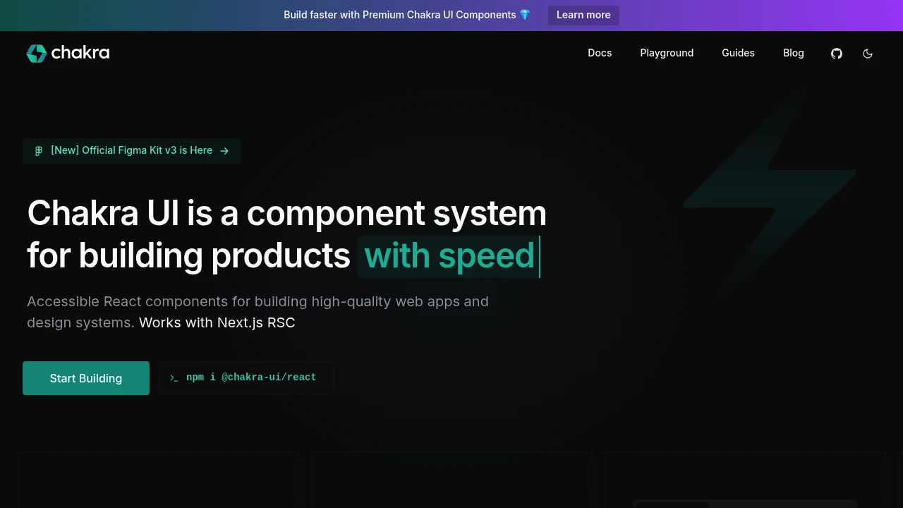
Chakra UI is a comprehensive component library designed to help you build React applications with speed and efficiency. It provides a set of simple, modular, and accessible UI components that are essential for creating high-quality web apps and robust design systems. With Chakra UI, developers can spend less time writing boilerplate UI code and more time focusing on delivering a great user experience.
Key features include:
- Accessibility First: Components are built with WAI-ARIA standards in mind, ensuring your applications are usable by everyone.
- Composable: Easily combine and customize components to fit your specific design needs.
- Themeable: Extensive theming capabilities allow you to define your design tokens, typography, and component styles, creating a consistent look and feel. This includes semantic tokens for streamlined design decisions, centralized typography customization, and recipes for designing component variants with ease.
- Developer Experience: Built by developers for developers, it offers a smooth and intuitive API. It also works seamlessly with popular frameworks like Next.js, including support for React Server Components (RSC).
For teams looking to accelerate development further, Chakra Pro offers premium pre-made components and page templates.
Similar to Chakra UI:
Your complete design toolkit for Framer & Figma. Build faster.
FigmaFramer
Access 1000+ components & templates for Framer & Figma. Design faster with responsive layouts, dynamic themes & lifetime updates. Your complete solution.
Your toolkit for crafting unified user interfaces.
CompanyFigma+2 more
Access design foundations, versatile components (Rails/React), layout tools, and developer guides for creating cohesive digital products. Supports SCSS & JS.
Craft beautiful, scalable products, faster.
FigmaReact+1 more
Accelerate product development with professionally crafted React & Figma component libraries. Build scalable, themeable, and accessible UIs efficiently.