
Wedges
Build UIs faster with open-source, accessible React components. Highly customizable, leveraging Radix UI and Tailwind CSS for modern, professional interfaces.
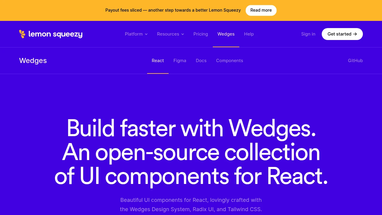
Wedges provides a professionally designed system for Figma alongside an open-source React UI library, expertly combining Radix UI primitives and Tailwind CSS. Developers can leverage a growing collection of pre-built, user-friendly, and customizable components designed to be directly copied and pasted into React projects. These components are meticulously crafted in Figma by design professionals, ensuring pixel-perfect UI elements for sophisticated interfaces.
Key advantages include:
- Built-in Accessibility: Constructed with Radix Primitives, Wedges is WAI-ARIA compliant out-of-the-box, offering robust support for screen readers, keyboard navigation, and other assistive technologies.
- Extensive Customization: Apply custom styling effortlessly with Tailwind CSS. A dedicated plugin facilitates the quick creation, switching, and customization of themes.
- Simplified Dark Mode: Transition between light and dark modes with ease. Wedges comes with a pre-packaged dark theme that can be activated by simply adding the "dark" class to your HTML.
Categories:

 Untitled UI
Similar to Wedges:

Ship faster with beautiful components.
ReactTailwind CSS
Access a premium library of 220+ React components to rapidly build AI applications, E-commerce sites, charts, and dashboards. Develop stunning UIs faster.

Craft exceptional experiences for Apple platforms.
Company
Access guidelines, expert sessions, and design resources to create exceptional user experiences for apps and games on Apple platforms.

Minimal Figma kit for rapid SaaS UI design.
Figma
Craft stunning SaaS interfaces with this minimal Figma UI kit. Jumpstart projects with one-time pricing & lifetime updates. Ideal for solo designers & teams.