
DesignCode UI
Access hundreds of Figma UI components & templates, Framer-ready. Organized with variables, variants & adaptive layouts for efficient, beautiful site creation.
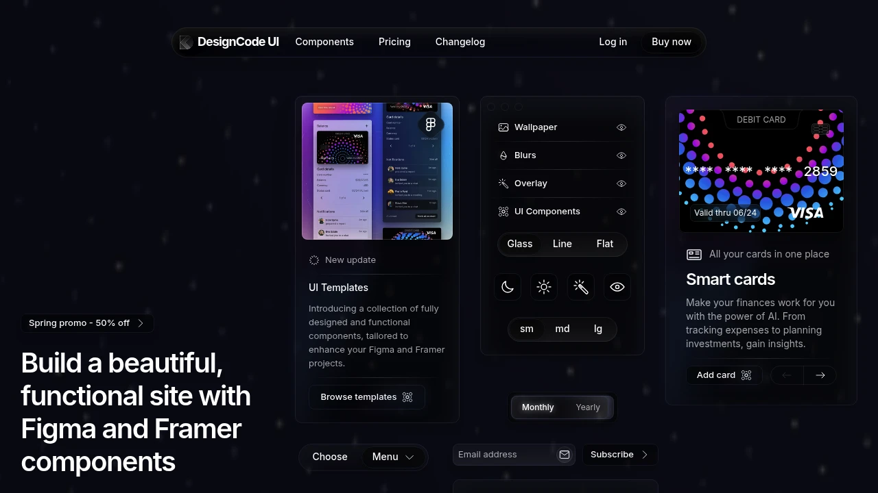
Discover an expansive design system featuring hundreds of Figma UI components and templates, all ready for seamless Framer integration. This extensive UI kit, born from decades of UI/UX design expertise, is meticulously organized with variables, variants, and adaptive layouts, ensuring every element, big or small, is a component. What makes this system unique is its distinct and personal theming; the background sets the mood, glass elements absorb colors, and shadows elevate the design, yet it remains incredibly flexible.
Optimize your design process with Figma's Variables and Framer's true implementation, ensuring design consistency and creating adaptable design systems. This all-in-one package provides:
- Over 300 components including Buttons, Controls, Menus & Content.
- More than 2,000 Figma variants and 2,116 unique icons.
- Full support for Light/Dark Mode, multiple sizes, and interactive states.
- Extensive customization for layouts, styles (Glass, Outline, Flat), patterns, breakpoints, and icons.
- Comprehensive guides, lifetime updates, and the ability to use on unlimited projects.

 Untitled UI
Similar to DesignCode UI:

Build experiences that inspire people.
CompanyFigma+1 more
Access a comprehensive design system to build inspiring user experiences. Includes Figma libraries, plugins, and engineering resources for development.

Build consistent, accessible, delightful user experiences.
CompanyFigma
Access open source building blocks to design and implement consistent, accessible, and delightful product experiences. Includes foundations, content guidelines, components, and patterns.

Craft consistent, accessible digital city experiences.
FigmaGovernment+1 more
Access comprehensive guidelines, design assets, and component libraries to create consistent and accessible digital experiences for a unified city brand.