
Helios Design System
Access open source building blocks to design and implement consistent, accessible, and delightful product experiences. Includes foundations, content guidelines, components, and patterns.
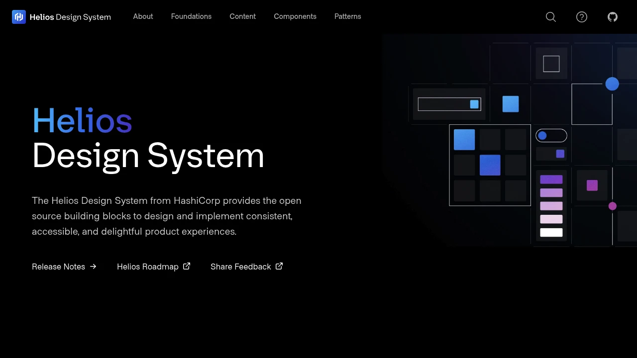
The Helios Design System from HashiCorp offers a comprehensive suite of open source building blocks designed to help you create consistent, accessible, and delightful product experiences. This system provides a solid foundation for your design and development workflows.
Key elements include:
- Foundations: Detailed guidance on core design elements such as colors, icons, and typography, ensuring visual harmony across all your products.
- Content: Structured guidelines on tone, voice, and user communication strategies to ensure clear and effective messaging.
- Components: A library of reusable UI building blocks that speed up development and help maintain design consistency with minimal effort.
- Patterns: Established best practices and guidelines for designing scalable and consistent user interfaces, leading to improved usability and a better overall user experience.
By leveraging these resources, teams can focus more on user needs and innovation, rather than reinventing common UI elements and design principles.

 Untitled UI React
 Untitled UI
Similar to Helios Design System:

Design and development perfectly aligned.
FigmaReact+1 more
Achieve consistent UI and quick development with flexible React components styled with TailwindCSS. Offers easy integration and Figma alignment for seamless workflows.

Design with clarity. Build with confidence.
CompanyFigma+1 more
Ship quality Atlassian interfaces using robust foundations, versatile components, and powerful tools. Design with clarity and build with confidence.

Design modern UIs faster in Figma. Eliminate tedious tasks.
Figma
Build visually appealing, consistent web UIs with an advanced Figma design framework. Offers 1400+ components, one-click dark mode, and easy customization.