
Tremor Blocks
Quickly build dashboards and charts with 300+ production-ready React and Tailwind CSS blocks. Features light/dark mode and customizable templates.
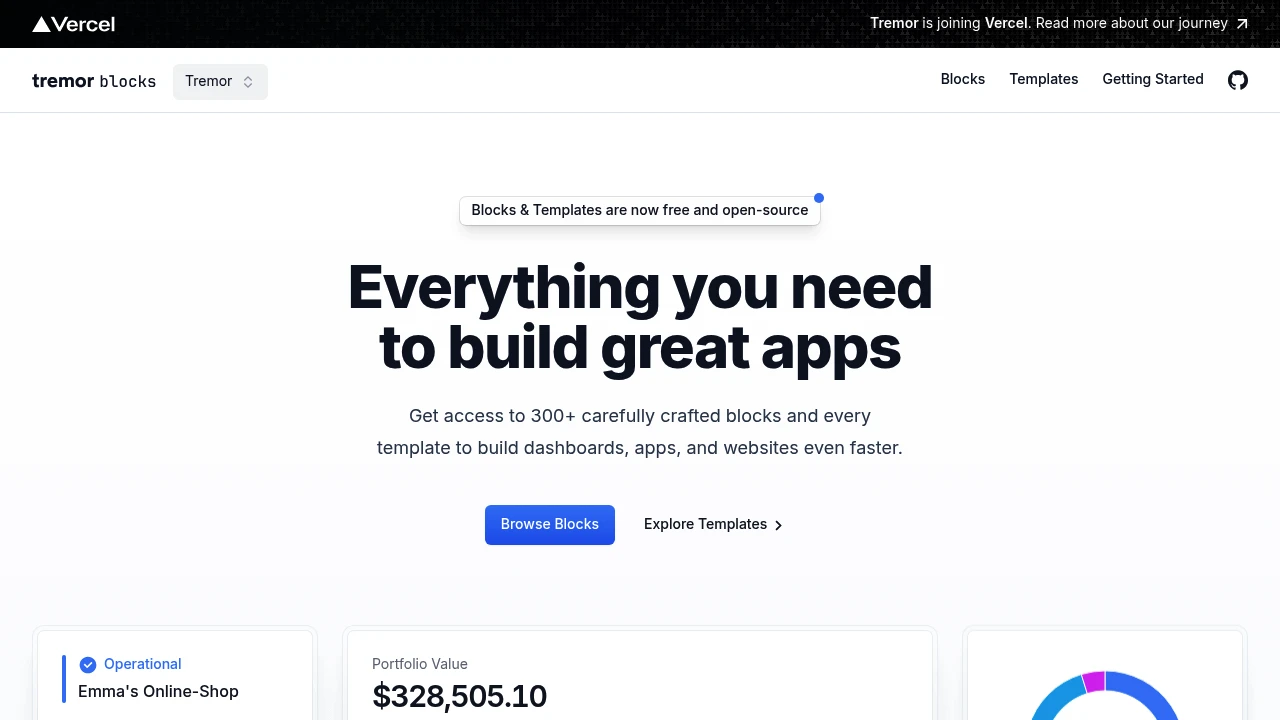
Access a comprehensive collection of over 300 meticulously designed blocks and templates to accelerate the development of dashboards, applications, and websites. These resources are built using React and Tailwind CSS, leveraging Tremor's robust open-source library.
Tremor Blocks provides a wide array of UI elements, from intricate charts to complete billing pages, enabling you to bring your ideas to life more efficiently. Key advantages include:
- Production-Ready: Copy and paste blocks directly into your projects.
- Tailwind CSS Foundation: Easily customize components to match your specific design requirements using Tailwind CSS utility classes.
- Community-Backed: Core components are derived from Tremor's open-source library, supported by over 15,000 GitHub stars.
- Extensive Collection: With 300+ blocks, find elements for various dashboard and application needs.
- Dual Theme Support: All blocks include light and dark modes by default, seamlessly integrating with the Tremor theme.
Additionally, explore production-ready templates built with the latest technology stack, including React and Next.js, designed to help you launch your projects faster.
Categories:

 Untitled UI
Similar to Tremor Blocks:

Modern UI components for your codebase. Build faster.
ReactTailwind CSS
Accelerate development with a React & Tailwind CSS UI kit. Get production-ready, customizable components directly in your codebase, built by Tailwind's creators.

Build accessible React UIs faster.
React
Develop accessible web applications and UI libraries with an open-source React component toolkit. Features copy-paste ready components for faster development.

Unified framework for cohesive product interfaces.
CompanyFigma+1 more
Establish consistent UI foundations across a product ecosystem. Unify diverse experiences with a comprehensive framework covering styles, expression, content, and accessibility.